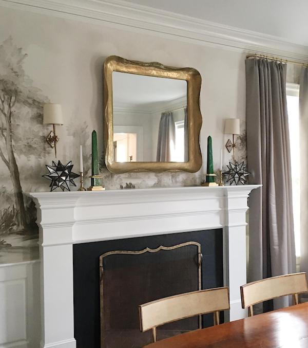
Carver’s Guild mirror – similar here // sconces // Moravian stars
In my reader survey, a few people asked about our dining room and if we had ever finished it. It’s SO close being totally finished. In fact, it’s just one wall giving me problems. So today I’d love to get your feedback on this wall, since I seem to be stuck!
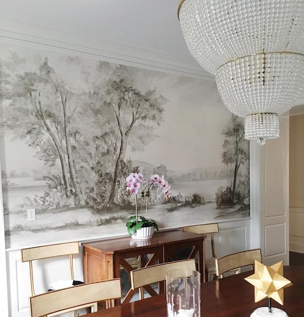
The photo above shows the wall with the fireplace, this area is DONE. The photo below, shows the wall with the best full view of the mural paper. I’m leaving this wall alone. So this area is done as well. (Find more info about the wallpaper in our dining room here.)
orchid // chandelier
chandelier
On this wall we hung a small painting. Clearly between the windows and drapes and mural paper, that’s more than enough, so this wall is done too!
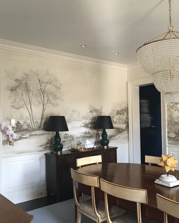
And, here’s the wall giving me “problems”… You might recall I had these green and black lamps in there. They didn’t look terrible, but they also never felt right to me. So after living with them there for almost a year, I finally switched them out to these clear and white buffet lamps. Between the height and color (or lack of color here) these look a lot better.
buffet lamps
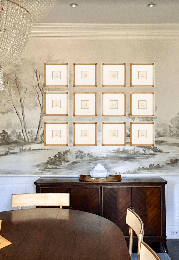
However, the wall itself looks kind of bland to me. Especially in the center of the mural where there’s more negative space in the design. So…here’s what I’m thinking for this spot, and I’d LOVE to hear your opinions on this, as I’m still on the fence…
framed Intaglios
You might remember this post I did on framed Intaglios. Since then, Tiberian Design has been amazing with working with me via email to find a look which suits our dining room. They even sent this mock up of a grid of framed intaglios. So helpful! And, they sent an actual sample of one framed Intaglio, it’s leaning against the wall in the photo above with the white lamps.
mirror
I was also toying with the idea of hanging another mirror over the small buffet here. It would bounce the natural light from the windows across the room, back into the room. The windows face north here, so it’s not a great room for natural light. Most of our dining room use is at night, so I guess it doesn’t really matter… Anyway, here’s my very amateur mock up of a the mirror I’m thinking of using here.
And, finally…it dawned on me I could possibly use both the mirror and the framed Intaglios. So here’s another very amateur attempt at photo shop to get a sense of it. What are your thoughts? Leave it all alone? Just the Intaglios? Just the mirror? Both? Help!:)
SHOP THE POST:
*This post contains affiliate links.


Love your dining room. I feel the art or mirror distract from the mural. I would leave as is or add something larger on the server!
A large mirror centered on the buffet/cabinet with wall sconces on either side.
Put the mirror above the console and the intaglios above the fireplace. The mirror above the console will reflect the dining table and the wallpaper above the fireplace is less busy for a grouping.
I absolutely love the grid of intaglios on your wall without the mirror.
Negative space is necessary in a well thought out design; it gives the eye a place to “rest.”
I would not put another thing there!
I agree with many of the comments that you shouldn’t put the intaglios or the mirror on top of the mural. I think the lamps are not working being clear and that the green ones looked better but with white not black shades. You already have an orchid in the room so maybe a large beautiful bowl or ginger jars in between the lamps. Or just one painting that is a very solid like a color field or color block painting in keeping with the other tones in the room.
I vote for a plant or minimalist sculpture sitting on the buffet. Please don’t cover up the beautiful mural :/
Just the mirror.
Beautiful room!
I liked it with just the intaglios. Might suggest using fewer as your lamps will be covering up some of them.
I think your problem wall looks very nice with the new lamps, sort of serene. If you want to add, I would go with the mirror. To go farther, I think, is too much… beautiful wallpaper and chandelier!
First off, you have wonderful taste! I love the wallpaper you choose for your dining room.
I find that we all have a tendency to want to over decorate rooms. I don’t think the little art piece looks good….its out of step with the feel of the room. If something is need there, the intaglios would look good. Love the lamp switch out….a really soft mirrow look here would be perfect…keep in mind that your wall paper is the “ART” of the room…let it shine!