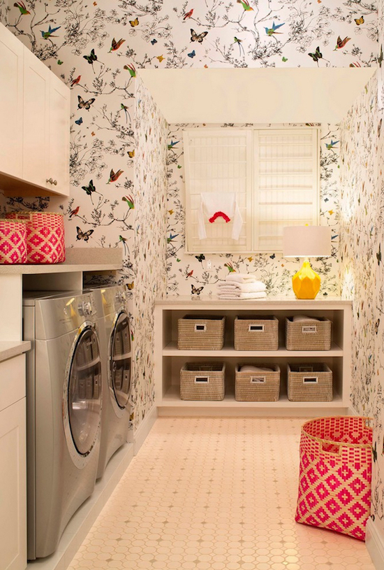
Welcome to week two of the One Room Challenge (see here for week one). Aside from the actual design aspect, a big part of this challenge is knowing how to budget the six weeks, which means a lot of decisions need to be made quickly. I must’ve stood in our laundry room for hours trying to figure out the best way to deal with the deep angles of the walls. Paint or wallpaper?
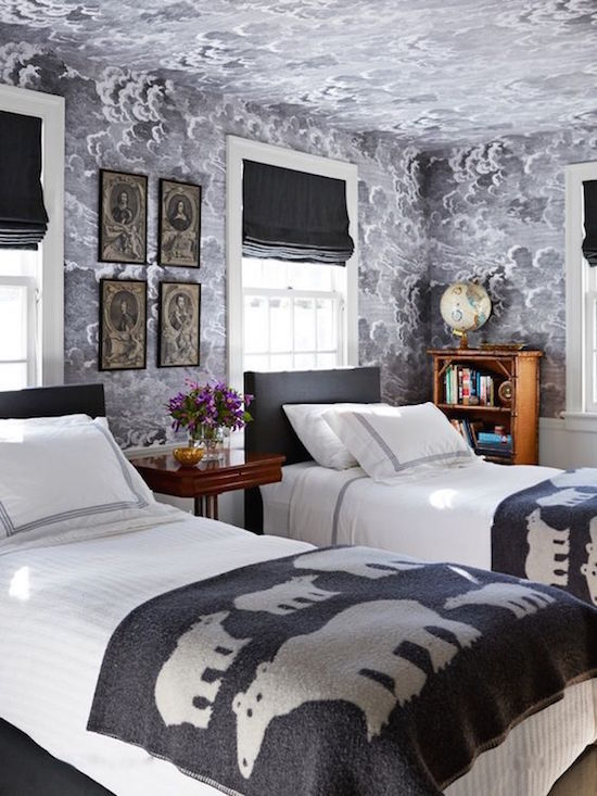
If paint was the direction, then I wanted to go crazy with new floor tiles (don’t love the current tiles). Crazy patterned walls and floors would be too much together. In the end, based on some outrageous demo/tile quotes I got, I decided to go with wallpaper. Even though most of the wallpaper samples were all a decent size, it was still pretty tough to tell how it was all going to look. Out of the four or five samples I narrowed it down to, I really fell in love withFornasetti’s Nuvolette cloud paper by Cole & Sons.
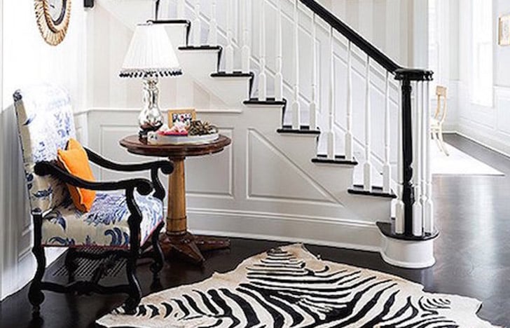
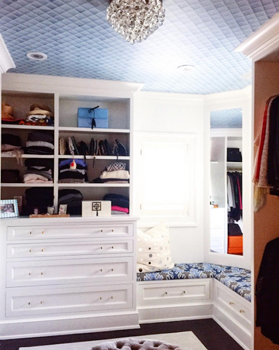
I’ve loved this paper for a while now, but still wanted to see how it would look on deep angled eaves. I took to the internet and did my best to find images with this paper on crazy walls. Here’s the best of what I found-plus the paper in an actual laundry room designed by Studio M.
